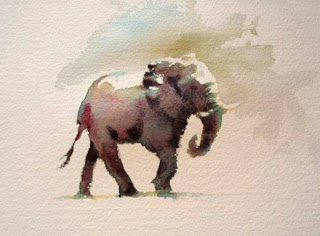
Getting back to Hazel's 4th day ....
We extended our learning to 'painting animals in watercolour' on the last day. Hazel stared a wonderful demo for us on painting Elephants. I unfortunately discovered as I sat down to watch that I'd forgotten to charge my camera battery and was unable to document her demonstrations. I was kindly loaned some pictures taken by a fellow artist Sylvia Coward of the final day's painting session.
Here we used various combinations of (transparent )pigment to create our ellies. The three basic colours which Hazel used were yellows, blues and reds. I always thought that Elephants were grey or, at least shades of grey. But Hazel with her three shades stressed that tone and not colour was the important factor in creating wonderful watercolour. Her use of these colours were excellent for achieving the correct tones. These lovely tones were created in layers or washes.
The next Ellie was more in proportion.... here we used Indian Yellow, Alizarin Crimson and Prussian Blue. In that order. Added blues to the shadow areas gave the elephant form and depth.
My final attempt with variation of tone was the use of Raw Umber, Prussian Blue and Carmine. Again using the three transparent colours, adding the red as a last wash. Mixing in a little darker values of the palette for the shadows.
Here is one of Hazel's Elephants..... please note the depth in her ellies with the correct placement of darks.
Photograph courtesy Silvia Coward
Softening the base of the feet with water gave the illusion of dust been kicked up as the ellies walked by.(photo Silvia Coward)
Here was my group painting, pity I added red in the background foliage.. that just killed the depth of my painting.
I thoroughly enjoyed my Elephant painting exercise.... I can see myself painting lots more of these guys !
Lastly, our final demo for the day was the lioness portrait. Here Hazel used her paper of choice- Khadi Paper, which is cotton rag paper made in India. It has a wonderful rough finish and perfect for textures. The colours come out more vibrant too.
She sketched her lion's head on the paper to follow the features more accurately. In this demo she said we were no longer painting shapes but painting inside a block, picking out the features one by one. Starting with the ears, a wet in wet section was painted, dropping in burnt sienna to the light ochre wash and the darks were then added, using Winsor violet. She lifted out areas of highlights with a clean damp brush then added sepia for more definition. She moved onto the face, again starting with ochre and burnt sienna, building up to the darks. The lioness' chin was next, after the ochre and b sienna was added a darker shadow area was painted in, using W violet. By dampening the paper inside the white bearded area with water and dropping in Winsor violet underneath leaves a lovely soft edge.The outline of the eyes were painted using sepia, softened first with a stroke of water on the outside so the eye wasn't left with a hard outline. She dropped in ochre and B sienna into the eye and a drier mix of sepia for the pupil but leaving the white highlight.
Again, photograph courtesy of Silvia
My lioness from a photo in my collection... not at all happy with the end result as I had overworked it. I realised I had painted it too light and went back in with stronger pigments.... Big mistake!!!! But, here it is anyway!!!!!!!!
My workshop with Hazel Soan was truly a memorable one. A warm friendly bubbly persona wrapped up in a tiny slender frame, Hazel is overflowing with artistic knowledge and enthusiasm.
This is not only an account of what I witnessed through detailed instruction as the inspiration I found and the sense of urgency at which I wanted to pick up a brush and paint. Thank you Hazel!


